A pandemic is a global phenomenon. It crosses borders but does not undo them; on the contrary, at times it seems that it reinforces them by revealing current power relations even more harshly. A pandemic is a health phenomenon which is eminently spatial. The disease is local, the epidemic regional or national and the pandemic global. In this, the spatial factor is fundamental and defining. Thus, there is no better tool than maps to represent how the virus spreads, how many deaths it causes, how its numbers decline and how its distribution around the world moves on. In our societies, maps are used to represent and seek solutions to problems of different kinds, but above all, they “work with spatial representation to make sense of their world” (Kitchin and Dodge, 2007). That is why I take the health contingency as a reason to discuss and reflect once again the usefulness, relevance, opportunities, dangers and traps of mapping and other tools for geolocation.
by Gabriela M. Fenner Sánchez
San Cristóbal de Las Casas, June 1st, 2020
Find the Spanish version of this text here. Translation by Eva Graf and Laurenz Virchow

“Your Health on Earth” by Odra Noel
Throughout the pandemic, various websites have provided maps in which the numbers of infected people in different countries of the world are being updated almost in real time. Along the increase of Covid-19 numbers and deaths, the colour red becomes more dominant on the map, putting us into an emergency mode and unifying the world in a catastrophic scenario. Countries almost vanish as all of them are displayed homogenously in the same colour or hidden under the red circles that gradually dominate the entirety of the mapped territory. These maps of the pandemic communicate two main notions: where the numbers are increasing (whether positive infections or deaths) and how quickly they are increasing. However, these maps do not only function to transfer these seemingly objective information but also serve as propaganda tools. Their visuality moves us into a state of alert that has the clear purpose that we shall adhere to regulations of the state. Presenting us figures in their official and authoritarian manner, maps claim to know “what’s going on” and thereby reaffirm the controlling function of the state. In this sense, the map of the John Hopkins University (UJH) is very illustrative. It presents the accumulated cases in red, while the current cases are presented in a more “calm” pale orange.
Yet, these maps are to be scrutinized not merely as representations but also regarding the reading process through which they exercise power. Their message is received differently, depending on who looks at them. New forms of territorialisation are unveiled when maps are being interpreted (Kitchin and Dodge, 2007). What is it then, that we can say about what we read in maps? At this point, only once, I remark that the sites that appear on world, national or municipal maps in “light colours”, with small dots or without any dots, are mostly regions like indigenous municipalities in Chiapas or on the African continent. Should I interpret that there are only so few cases in these places? Are people immune to the virus or are the measures so efficient that nobody gets infected there? Or is there rather a lack of an adequate infrastructure to treat, register and report positive cases? The map doesn’t tell us. Does this, hence, imply that it lies? Yes, and no. It depends on how we read it. It is not like “maps show what’s really happening” but rather like “maps display the data that are known”. One thing that absolutely makes me suspicious is the fact that of all municipalities those with a high concentration of indigenous and other marginalized population as well as entire countries are those who “report fewer cases”. I wonder if what we see is better interpreted not as success of their public policies but rather stem from a lack of infrastructure to monitor and control health emergencies. In the case of some countries, however, we can also identify the point in time as a reason: They are either at the outset or at the end of their epidemic curve.
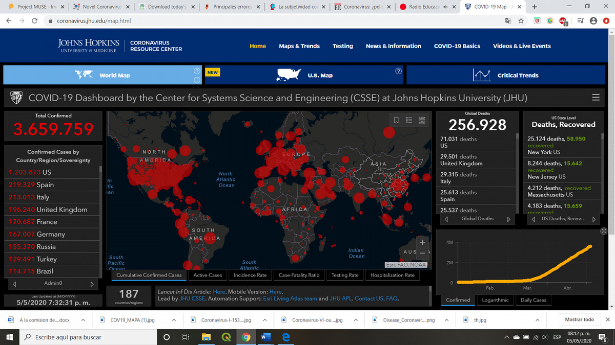
Screenshot: John Hopkins University “Covid-19 Worldmap: Cumulative Confirmed Cases“
Let us always remember that maps are only an input to existing systems. In order to really understand phenomena displayed on maps, we have to dig deeper in our investigations, ask questions, interrelate information and analyse the intentions behind maps. Without any doubt, the Covid-19 maps serve the interest of nation-states which are overwhelmed by the pandemic and forced to set up different health control measures in two ways. Firstly, it causes alarm amongst the citizens and thereby promotes civil obedience. Secondly, it demonstrates that the state is in control of the situation. In this regard, it is worth evoking Philipe Rekacewicz’s (2015) statement once more that “control of the image of the territory is a control of the territory itself”.
With regards to representation some more elements are worthwhile noting. One is that, despite the multiple projections that exist to represent the globe on a flat surface, almost all of the Covid-19 maps use the classic Mercator projection. It is the dominant projection worldwide that enlarges the poles and thereby reinforces the impression that Europe – located in the centre of the map “by default” – and North America have a territorial extension. Another element is that evidently all maps hold on to the convention of placing the north at the top. The moment of emergency, that is to say, underpins hegemonic structures like the state, western science and conventional cartography. A brief review of the cartographic representation applied by different continents allows us to observe that countries as diverse as Iran, Poland, Germany, Saudi Arabia or Mexico use the same data platform that ESRI – one of the leading companies for software for Geographic Information Systems – has offered for this purpose (the same as that of John Hopkins), thus generating a homogenised visuality for different countries. Even though this might make comparisons easier, it also holds back each country from creating its own analysis and visuality, or in other words, from generating its own message of what is happening.
In addition to the way the pandemic is represented, either in colours or in circles, with one or another projection system, scale also plays an important role for both, the purpose and utility of the map. Global maps, such as those of the UJH or the World Health Organization (WHO), represent the number of cases per country with a circle located simply in the centre of the country or in its capital indicating the total number of people infected with size of the circle. This is not to say, however, that all infected persons are located at that point. A global map may get away with this, after all its analysis compares macro regions and thereby neglects local actors. Yet, already within our borders, reinforced by the security promises offered by governments, the main interest is to know the detailed spatial behaviour of the epidemic; that is, on a more regional or even local scale. As contemplators of these maps we probably want to know more about how dangerous our area or exact location is, how close we are to infection hotspots and, thus, how exposed we are. In turn, this leads to an urge for a map that tells us how free we can still be or how free we can already be according to the epidemic situation in our respective country and region.
Precisely the maps which were generated through collaborative platforms have contributed to this more regional or local monitoring, i.e. through interactive online-maps that users from anywhere in the world can feed with data. These platforms have been used mainly for two different purposes: on the one hand to monitor the pandemic, and on the other hand to provide containment tools to cope with it. Those maps which, like in official maps, seek to track, report infection and death rates have used the most popular and accessible platform Google My Maps (see for example). Some of these maps represent each of these cases as point markers (i.e. looking for precision); others use uniform colours by entity (see, for the case of Mexico) as the figures have been increasing.
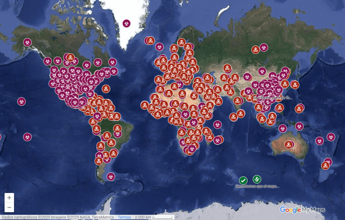
Map titled “Coronavirus – Here you can see places already confirmed with coronavirus and those under suspect”
Disadvantages of this type of map are that it does neither indicate sources nor does it seem to have rigorous control of the information that is entered. Despite that, one of these maps, in Mexico, made a valuable contribution to the collective psyche as it began to map the recovered cases as well, long before government sources did. This somehow conveyed a more dynamic message of the epidemic, not only in a catastrophic (cumulative) sense but as a process that has a beginning and an end. At the global level, as I mentioned above, the comparison between cumulative cases and active cases on the HJU map also allows to see a clearer temporal picture of the pandemic.
Furthermore, collaborative platforms are being used for solidarity mapping. This is to say, for maps that display distribution places for food or other necessities. Since in all countries the pandemic has not only provoked a health crisis but also an economic and survival crisis, collaborative maps such as “Parando la Olla” in Uruguay, “Aplana la curva” mainly in Europe, “Mapeamento de Redes Colabortivas enfranchimento ao Covid-19” in Brazil, “Menos distanciamiento social y más solidaridad popular” in Mexico, “Mutual Aid Michigan” in the United States and “Kenya Covid-19 Tracker-MapKibera” offer or request mutual aid. “kollektiv orangotango”, for their part, created a map of these maps. It allows to connect these mutual aid efforts as well as responsible and critical acts of rebellion in the face of global isolation. Participatory digital mapping thus shows its social and political potential, contributing to the strengthening and creation of networks, in times when individualism may appear as a necessary evil.

kollektiv orangotango’s “Mapping solidarity in times of covid-19” map
However, digital cartography has not only taken advantage of maps as a static or dynamic representation but as digital tracking to aid contact tracing through GPS. Governments in different countries developed mobile software applications to voluntarily or compulsorily monitor people with their cell phones. These apps either ask users to report about their “health” in order to identify timely outbreaks of infections (e.g. China, Singapore, Australia, India) or they ensure that confinement and social isolation is being complied with (Poland, Colombia). Even though the South Korean government did not develop a specific app, cellular GPS, triangulation trigonometric measurements as well as banking transactions were applied to monitor people. I cannot tell how effective these measures are. But I would like to point out that this use of geolocation is controversial since it highlights, legitimizes and reinforces the social control exercised through technologies, not to mention the immense amount of “bigdata”, which is being generated and ready for extraction by the large communication companies (the so-called GAFAM). The concern about the invasion of privacy that these tools represent has led to a great deal of opposition from the population in countries such as Germany and Austria.
Finally, I would like to mention that satellite imagery is being used to monitor changes in mobility in different cities at a global level as well as air quality. It could show how air quality has improved noticeably thanks to the momentary standstill of traffic and millions of people around the world. This whole panorama reminds us that, although “maps are products of power and produce power” (Kitchin and Dodge, 2007), this power is neither monolithic nor necessarily of a domineering nature. It is true that states seek to reinforce their legitimacy based on the “authority of the map”. But it is also true that as the access to digital technologies and data at the global level broadens, the use of cartography becomes more complex and offers new opportunities in pandemic contexts for various actors. This reaffirms the idea reflected by J.H. Andrews (2005) that the power of a map is given by a chain of causalities, including the users, and not by the map itself. This essay is therefore an invitation to critically read maps, to explore what they believe in and what sources they use and to analyse their – that is, their creators’ – objectives. At the same time it asks to apply tools that we have at hand to also become cartographers, collaborating to create spatial information that are useful to make sure that all of us are being taken care of; for now in the context of the Covid-19 pandemic, but why not after it, too?
Gabriela M. Fenner Sánchez is part of LACEM-CESMECA, Geobrujas – Comunidad de Geografas and ESTEPA Research Group
References
Andrews, J.H. (2005). “Introducción: Significado, conocimiento y poder en la filosofía de los mapas de J.B. Harley”, In: Harley, J. La Nueva Naturaleza de los Mapas. Ensayos sobre la historia de la cartografía, FCE, México, pp.21-50.
Harley, J. (2005). La Nueva Naturaleza de los Mapas. Ensayos sobre la historia de la cartografía, FCE, México.
Kitchin, R. and Dodge, M. (2007). “Rethinking maps”, Progress in Human Geography, 31(3), pp. 331-344.
Rekacewicz, P. (2015). “Between Art & Politics”.


